A live online language school designed as one product for two distinct user groups. Five years as the sole product designer for the real-time classroom and student space—across web and mobile, using a design system built from scratch.
EdTech · SaaS
Industry
Product, IA, UI, design system
Role
Web · Mobile
Platform
0→1 platform
Type
2019–2024
Timeline
Company

Fluentbe platform - two perspective
01 / Overview
Generic video calls weren’t built for structured teaching. Async apps weren’t built for live instruction. The real challenge wasn’t a good classroom—it was one coherent product for a teacher who needs control and depth and a student who needs focus and simplicity.
Problem
Generic video calls weren’t built for structured teaching. Async apps weren’t built for live instruction. The real challenge wasn’t designing a good classroom—it was creating one coherent product for a teacher who needs control and depth and a student who needs focus and simplicity.
The task
Design the real-time classroom and the surrounding student space—booking, progress, materials, and messages—as one system that serves both roles without compromising either.
My role
Sole Product Designer for five years: end-to-end UX and UI for both surfaces across web and mobile, supported by a design system built from scratch.
Scale
Fluentbe has 40,000+ students, 1,000+ teachers, and 1M+ lessons delivered. Figures published by Fluentbe.
02 / Discovery
Students and teachers don’t share the same mental model—they share a product.
Teacher

Job
Run interactive lessons in real time and keep students engaged.
Pain
Manage exercises, switch materials mid-lesson, and monitor engagement at the same time.
Context
Live teaching requires control and depth—a full control layer within reach.
Student
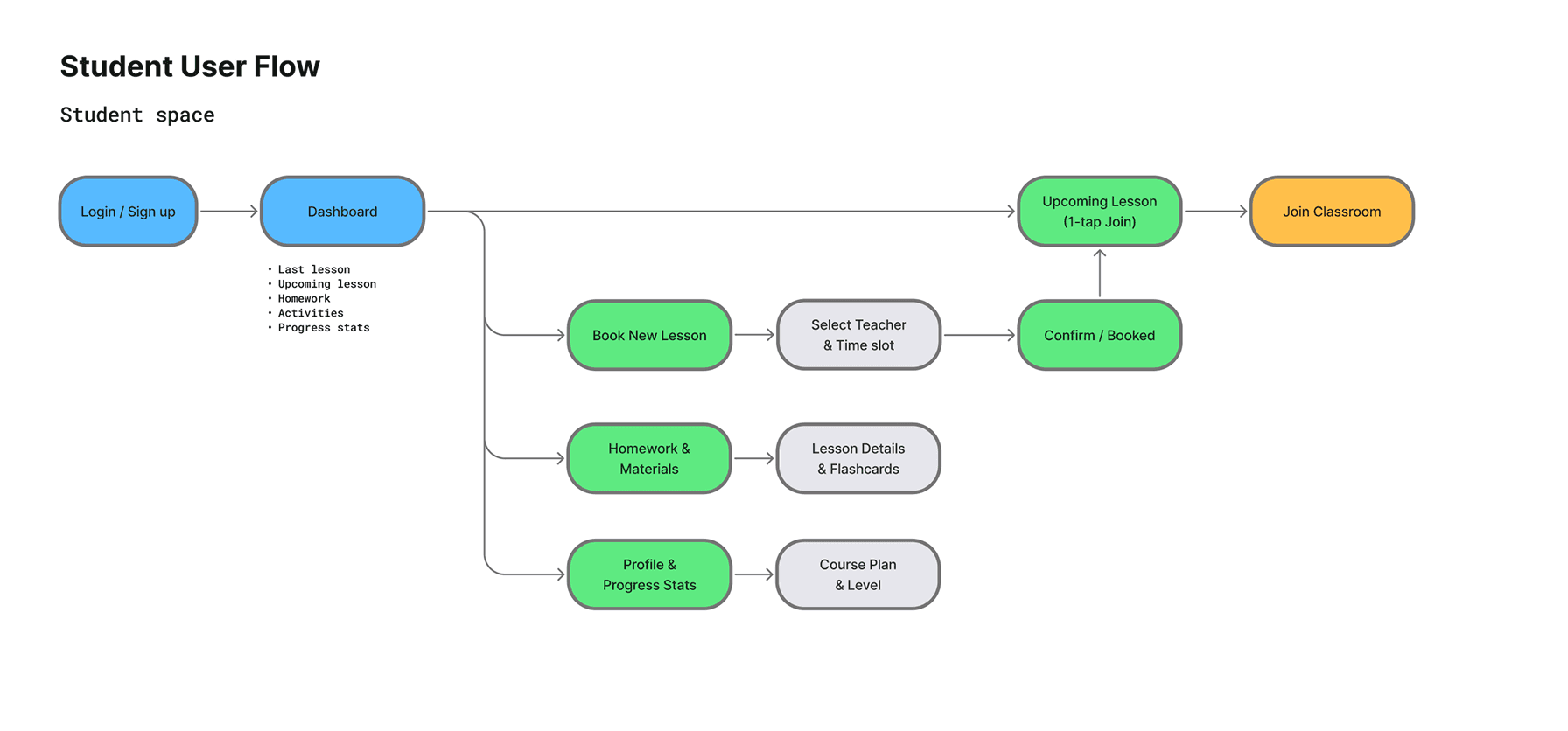
Job
Focus on the current task and track progress over time.
Pain
Generic tools create distractions, while staying motivated over months is difficult.
Context
One focused workspace with only the current task visible; progress as motivation.
03 / Classroom
Teachers needed a control layer: a lesson plan, timer, material switcher, exercise instructions, and student notes. Students needed the opposite: a clean, focused workspace with only the current task visible.
The solution was two distinct interfaces that felt like one product—the same visual language, but completely different information architectures.

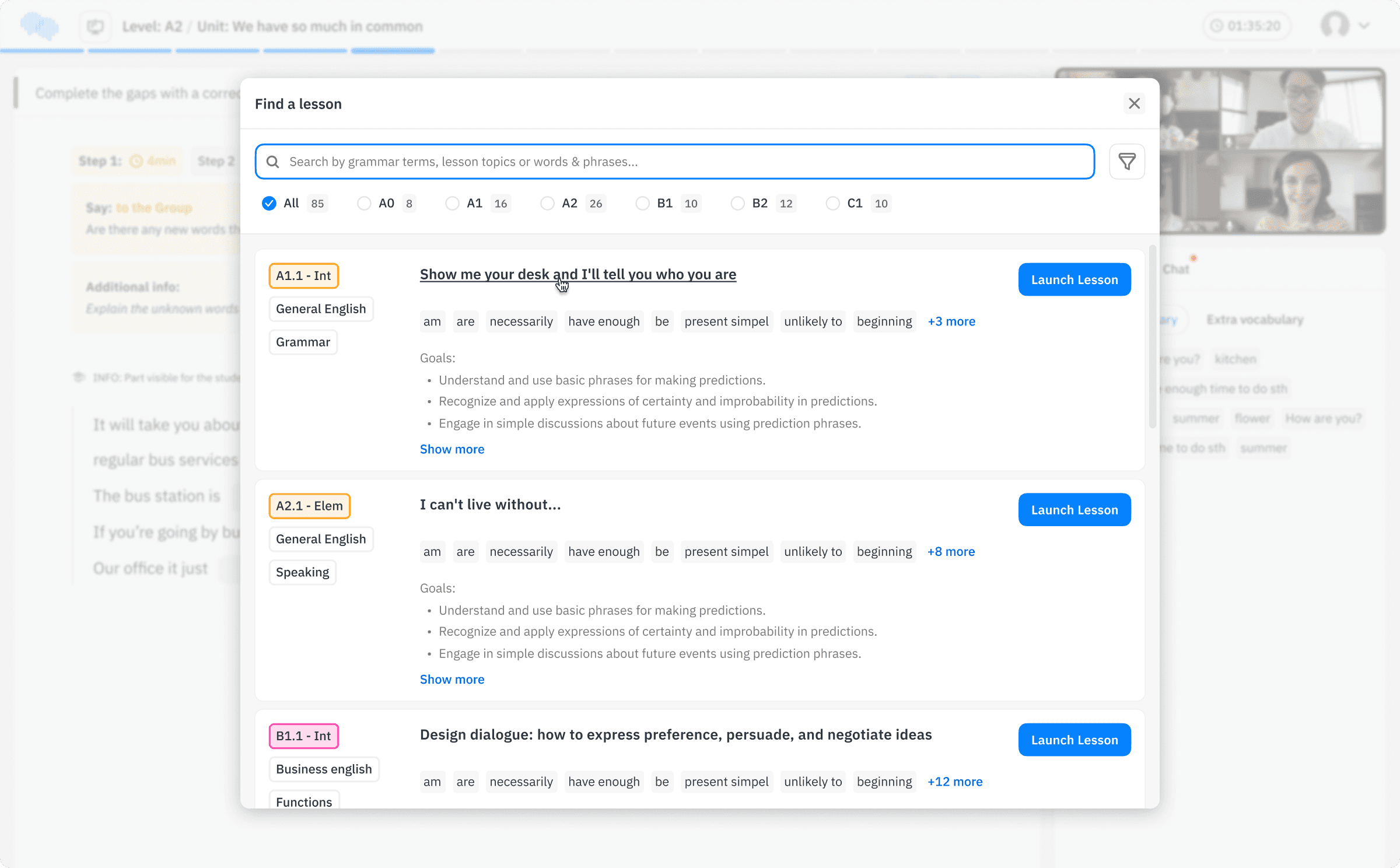
Teacher · swap materials live
Search for and swap materials mid-lesson, because real teaching drifts from the plan—and the tool must never force a restart.

Student · lesson view
The same lesson moment, the opposite interface: a clean workspace with only the current task and zero controls.

Problem
One classroom, two roles with incompatible needs. A single generic structure adapted for each role would have compromised both.
Decision
I treated the teacher and student experiences as two design surfaces, each with its own information architecture, navigation logic, and task flows, while sharing one visual language and one design system.
Rationale
A shared information architecture would have forced the student to carry the teacher’s controls, or the teacher to give up depth. Sharing the system rather than the structure kept the product coherent without making either role pay for the other’s needs.
Trade-off
Two architectures to maintain, with every new pattern designed twice: once for a dense surface and once for a sparse one.
03 / Student space
The classroom is where learning happens. The student space supports everything around it: booking lessons, completing homework, and tracking progress over time.

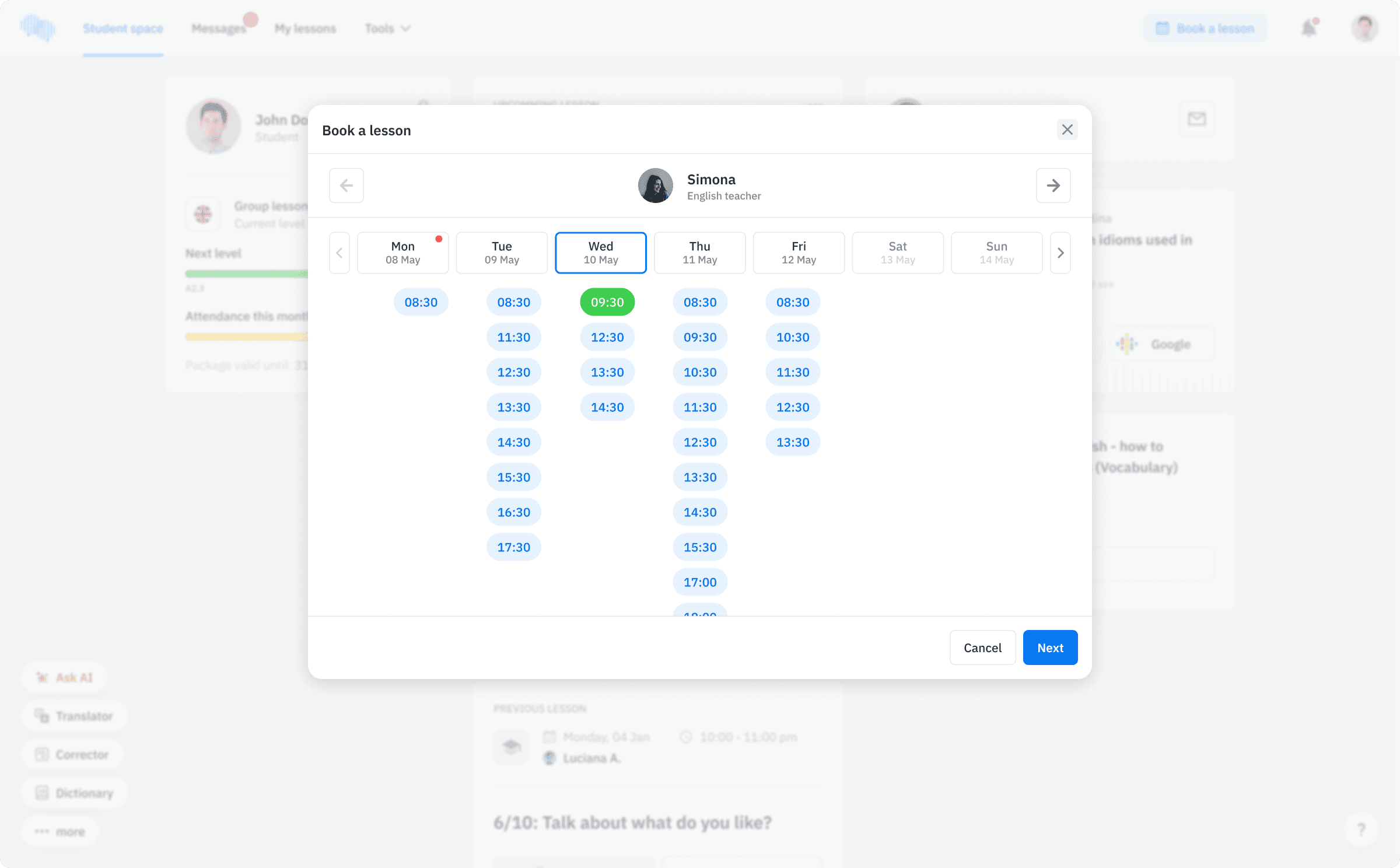
Book a new lesson.
Booking as a lightweight modal, not a separate screen — reserving a lesson doesn't pull the student out of the course context.


Messages
Group discussions between teachers and students after the lesson—supporting continuity in the relationship beyond the classroom.
Problem
Fluentbe sells a subscription. The risk for a learner isn’t a difficult lesson—it’s a quiet month in which nothing visibly moves and there is no reason to renew.
Decision
Level, attendance, package validity, and certificates are primary objects in the student space rather than statistics buried in a profile.
Rationale
In a subscription school, the decision to continue is made outside the lesson. Progress has to be readable the moment a student opens the product, not after they go looking for it.
Trade-off
Putting progress in the foreground also makes a gap visible. I accepted that: a signal a student can act on is worth more than a flattering one.
The first version focused on getting structured lessons up and running. What followed was shaped by the materials rather than the original brief. As Fluentbe expanded its methodology, new exercise types and lesson formats kept arriving, and the classroom had to evolve from a set of screens into a template that could support new exercise types without additional design work.
The teacher control layer was continuously refined based on feedback from the people creating the materials—the advantage of designing for a school that owns its own methodology.
The clearest example is the per-exercise instruction pattern. It began as descriptive prose: accurate, but written to be read. A teacher in the middle of a lesson does not read—they glance. I rewrote the pattern as short bullet points and placed the block on its own background, visually separate from the rest of the control layer. The content did not change. What changed was that teachers could find the relevant line without having to stop the lesson to parse a paragraph.
That change did more for teacher attention than any layout adjustment. The instructions competed with the exercise not because of where they appeared, but because of how they were written.
01 - Design outcomes
Two production surfaces across web and mobile, one design system built from scratch, and a set of patterns the product still runs on: the exercise template, lesson states, the teacher control layer, and progress in the student space.
02 - Scale
Fluentbe has 40,000+ students, 1,000+ teachers, and over 1M lessons delivered. These figures describe the school, not my design. I include them because they show the scale the interface has to support.
03 - What I can't show
Retention and lesson-level performance data exist, but they are not mine to publish. The outcomes above therefore describe design outcomes rather than business results.
5
years in production — a running school,
not a concept
1
design system, built from scratch
Honest status
Shipped and operating—Fluentbe.com is a live business. Public post-launch metrics are not mine to share; retention and lesson-delivery figures would turn this qualitative status into hard numbers.
With five years of watching teachers work with it, I would push the teacher interface much further toward less UI. Instead of keeping every control visible at once, I would show only what the current moment of the lesson calls for—this exercise type, this step, and the one action that matters next—and let everything else stay out of the way until it becomes relevant.
That is a revision of my own trade-off rather than a correction of it. Density was the safer default while neither the materials nor the lesson formats were settled. Now that both are, the interface can afford to know where it is in the lesson.